“The Death of the Public Library” Final Project

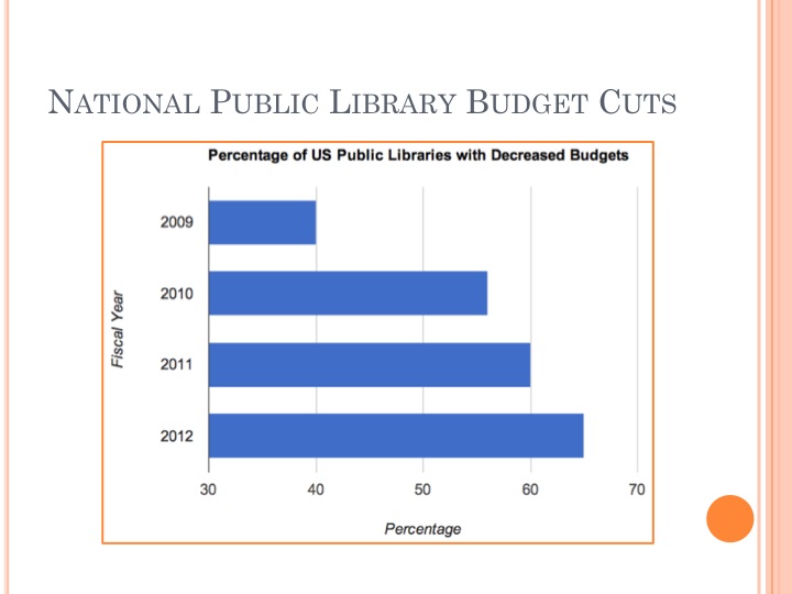
During the recession, various programs and services around the country faced funding cuts and economic strife. However, the extent to which public libraries, on a national scale, were affected is unacceptable.

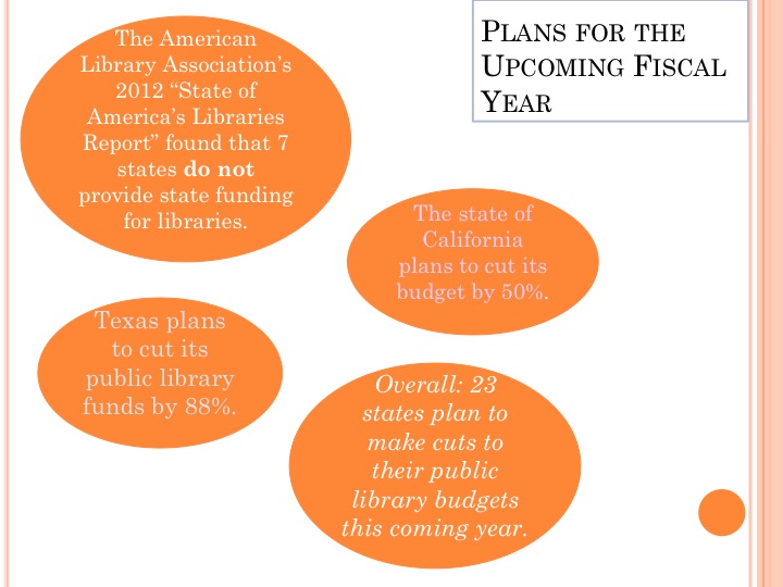
The above slide identifies the nation-wide issue of public library funds being cut by extreme amounts. This slide specifically states that next year, Texas plans to cut its funding by 88%, California plans to make cuts by 50%, and overall 23 states plan to cut funding for public libraries. These outrageous statistics can no longer be overlooked by the general public.

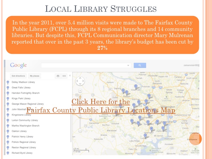
The link to the google map mentioned in the above slide can be found here. Despite serving the greater good of our country through its 22 facilities, the Fairfax County Public Library has received constant budget cuts in the past few years. The map identifies each public library location as well as provides a photograph of each institution.

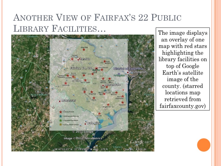
The above slide displays the “image overlay” concept. An older map from The Fairfax County Public Library’s website features red stars indicating each library belonging to the system atop the google earth satellite image.

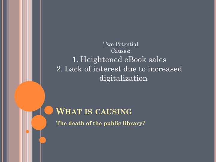
Aside from being an economic scapegoat from which funds are constantly being cut amidst economic hardship, many other causes for the death of the public library can be identified. Two key causes include the recent increase in ebook sales nationwide and the lack of necessity plaguing the public library due to resources, opportunities, and convenient short cuts provided by our increasingly digital and internet-dependent culture.

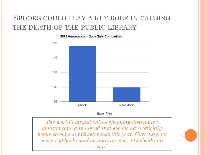
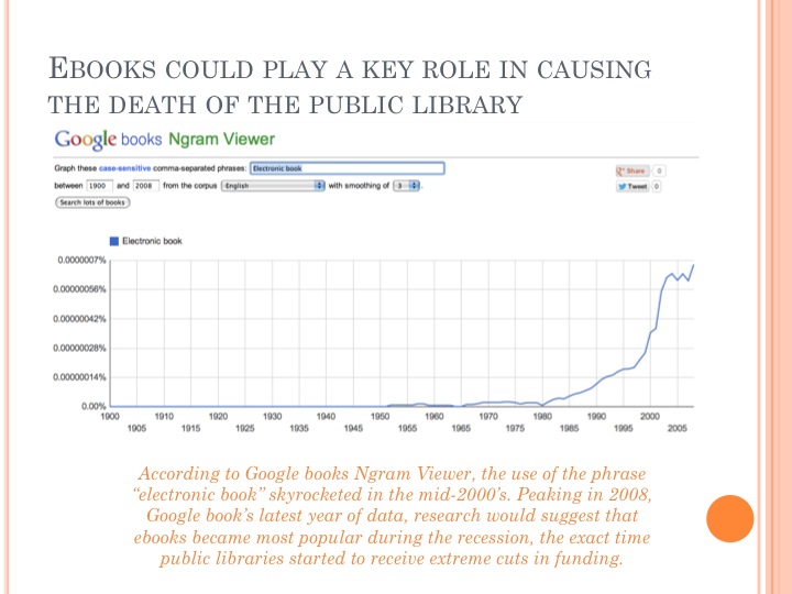
Recently, ebook sales have increased greatly. Given this, the desire for and need of printed books, as found in public libraries, has consequently decreased. With easily accessible and more affordable electronic alternatives, books, as well as libraries, face a devastating fate in the future of our technological society.

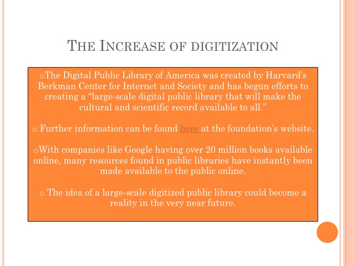
Ultimately, The Digital Public Library of America aims to digitize all of a physical public library’s resources to be made available to the public instantly online. With projects such as this one, created by the Berkman Center for Internet and Society and supported by the Alfred P. Sloan Foundation, the future of a completely digitized public library is not only a plausible idea, but a potentially imminent establishment.

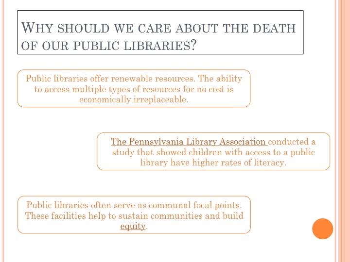
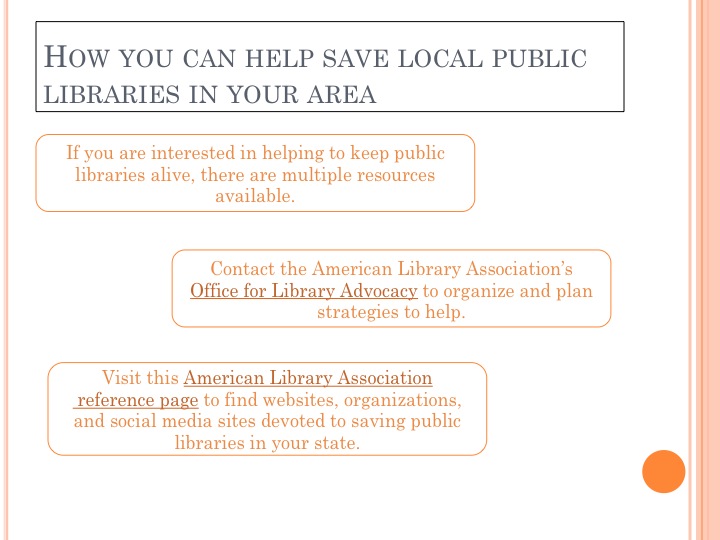
Even if we are not personally concerned with utilizing public libraries in our area, many individuals rely on the resources made available by these facilities. As with any government or communal change, grassroots efforts are crucial to the achievement of any sort of policy change. It is up to us as citizens to take it upon ourselves to present our problems with the current dying public library system to our leaders and officials.

Plan for security and restoration:

Currently, the project is saved on my computer. However, soon, the project will need to be saved in alternate ways. Going by the principle of safety and security, “LOCKSS,” or “Lots of copies keep stuff safe,” I will save my project to a flash drive. Additionally, I will print the project out on paper and keep a hard copy in a secure location. Finally, I will email my project to my family computer at my home in Massachusetts. This way, there will be one more electronic version of my project saved on another system.

If this project were to evolve into a larger experience and gain partnership with a large organization or initiative aimed at improving the plight of the public library, I would further increase security and ensure restoration by saving all information on a large server, with the assistance of my newfound partner.

Finally,

This final project has been more than just an assignment for me. Rather, it has turned into an opportunity to learn, research, and understand fully an issue that is largely overlooked by our mainstream society. Thinking back to my childhood, I fondly remember my hometown’s public library. Unfortunately, after doing some research, I found that my beloved hometown library, much like the others I’ve researched, is struggling with budget cuts. Prior to investigating my own library, the statistics were just numbers and the libraries in articles were just names. Now I have a personal attachment to this issue. Reading some of my first chapter books took place in my hometown’s public library. I fondly remember renting PBS movies, spending the day in the children’s section with my neighbors, and treasuring having my own library card. The subject of the dying public library must be addressed as soon as possible. I hope that anyone who reads this blog or comes across my final project topic feels the same way.


Scratch that…

The above video offers an introduction to Scratch. Scratch, a new programming language designed by MIT aims to “let you create your own interactive stories, animations, games, music and art.”

After reading and understanding its in’s and outs, I have mixed feelings about Scratch. Part of me wants to say, “So what?” It’s a programming language that allows you to create a little figure and make it move around your screen. You can create, detail, demand, and direct your little guy and add sound effects.

Initially, I was widely skeptical. I kept thinking to myself, why would I ever want to spend my time making a little cat and having it run around and say things? And honestly, had I just watched the video and read through the program’s details, that would be the total of this blog post: “Scratch is dumb, I would never want to do this.” But then, not knowing what else to write on the subject, what did I decided to do? GOOGLE it. Of course.

Doing a quick google search, I realized that the simple, seemingly pointless nature of the program is not at all a bad thing. Reading what people say about Scratch and seeing its description on Wikipedia, I understand that so much of Scratch is directed to children. Children are the target audience and the point of this programming language is to make it simple, easy to use, and inspire young creative individuals to pursue their interests in programming and designing.

As a child, I probably would have LOVED Scratch. Thinking back to the activities and games I participated in as a child, I’m able to see many parallels between my own childhood computer games and Scratch. Lots of the games I played were pointless and simple. But more importantly than how stimulating and exciting they would be to a college student, they served as stepping stones to the next level of creative activity.

Overall, I’m not the biggest fan of using and figuring out Scratch myself. And don’t even get me started on that frustrating block maze. However, the objectives of the program, I am very impressed with. If it takes giving some commands to a talking, dancing little cat to spark some creativity and passion in a few young people, I’m all for it.

Way to go MIT!

Preserving the Past in a Digital Era

Roy Rozenweig’s essay details the discussion of our ability to preserve the past through digitization. Specifically, with the internet, Rozenweig explains that SO much information about certain historical events such as 9/11 are easily searchable and made memorable by search engines such as google. However, Rozenweig warns that this digitization is not a permanent remembrance of the past:

Not only are ephemera like “Bert” and government records made vulnerable by digitization, but so are traditional works–books, journals, and film–that are increasingly being born digitally. As yet, no one has figured out how to ensure that the digital present will be available to the future’s historians.

Through his work, Rozenwieg presents an interesting idea: current historians and history teachers must think “simultaneously about how to research, write, and teach in a world of unheard-of historical abundance and how to avoid a future of record scarcity.”

Though we are currently in a “golden age” of documentation and historical archiving, this golden age could unexpectedly fall. The article presents the thoughts of one writer for the Washington Post who noted that this society of preservation could fall just like societies of prehistoric times, considering the idea that, “The members of prehistoric societies did not think they lived in prehistoric times.” Rather, “They merely lacked a good preservation medium.”

WIth Rozenwieg’s ideas afloat, it was interesting to move on to the exploration readings of The April 16 archive, The Hurricane Digital Memory Book, and The September 11 Digital Archive. Each website offered various personal accounts and remembrances of these tragic events. Each reading or entry was more vivid and pathos-filled than the last. The Hurricane Digital Memory Book told stories of survivors from the Hurricane as well as recollections of lost loved ones. The September 11 Digital Archive offered similar stories, and the April 16 archive had collected memories of the Virginia Tech tragedy.

One of my favorite posts was this quick little mention in the April 16 Archive. It was called “Bear Hugs” and merely stated that “free bear hugs were set up in the student lounge shortly after the incident. I thought this simple gesture was one of the kindest and simplest actions anyone could have taken:

After viewing all of these heart-breaking, saddening archives, I’m going to need to listen to some upbeat music. However, I’m also left with what I think Rozenwieg wanted me to come away with after reading his work: We live in a time where literally anything and everything can be digitized and preserved. However, this ability has immeasurable implications for our society and raises important questions like, “Is this digitization permanent? Is it accurate? How much will we have preserved 100 years from now?” These are crazy questions, but I’m not sure if we will ever find the answer to “what will happen when” until we are actually thrown into the future.

Corpus, Ngrams, and Charts!

The first exploration exercise of this week was to view the Time Magazine Corpus. I must say, though this service provides copious information and historical research, I cannot stand it. I think the site is ugly, bland, and makes me think I’m on a website with an Excell sheet that will never fully load. Furthermore, I think, thought the information is there, it is confusing. Things are not clearly explained or presented. I DO NOT like this Time Magazine Corpus at all.

However, while I detested the Time Magazine Corpus, the other area of exploration: Google Ngram was extremely entertaining and easy to understand. Essentially, Google Ngram allows you to enter in a word or phrase and search it through their corpus of google books. It will tell you how frequently the specific word or phrase appeared in Google Books across the years.

For one search, I chose to enter in the word “gay.” As a gender studies minor with an interest in the LGBT movement, rhetoric relating to the LGBT community has always fascinated me. I figured entering the word “gay” into the Ngram Viewer might spark some interesting results.

Here is a screen shot of the findings:

The word was used in .00064% of books in the early 1800s. Though there was some fluctuation over the next two hundred years, the frequency lowered significantly until its ultimate peak of .00077% in 2000. I think that this simple graph can say a LOT about the word “gay.” Though I have yet to research this further, it is my assumption that gay was used more frequently in the early 1800’s because it had a different meaning during that time. “Gay” meant “happy, or joyous.” However as the term began to associate itself with homosexuality, it was used less frequently, given the taboo nature of the sexual orientation. Then, as the new millennium approached and the Gay Rights Movement began to increase and expand, so did the word’s usage in literature.

Perhaps one day I will research this further, but until then I will continue to hate Time Magazine Corpus and love Google Ngram Viewer.

From Babel to Knowledge

This week, we were responsible for reading Professor Cohen’s From Babel to Knowledge: Data Mining Large Digital Collections. The reading described Jorge Luis Borges’s short story The Library of Babel in which the narrator describes bizarre rooms filled with books piled on top of books and all the pages of all the books contain incoherent letters and scrambled messages that make no sense. Used as an attention getter, this story ultimately links to various ways in which people are able to sift and sort through digital information. The reading brings up a “syllabus finder” used to find, locate, and organize various syllabi that professors may put online. This notion highlights the idea of information sorting through things like keyword searches and date entries that we have addressed numerous times in class.

The reading went on to discuss the more complex information searching application of “question and answer.” This idea of typing a question into a specific information search and instantly receiving an answer is quite complex. The reading states:

QA is a far greater challenge than document classification because it exercises almost all of the computational muscles. Not only do you have to find relevant documents in massive corpuses (involving methodologies of search and document classification), you also have to interpret users’ questions well to know what they are looking for (natural language processing) and analyze the text of retrieved documents using a variety of statistical and linguistic methods (information theory, regular expressions, and other text parsing techniques).

Immediately, this QA made me thing of one of the most frequently used online question and answer services: Yahoo answers

Though the purpose is to answer your questions quickly and accurately, there is overwhelming room for error. This specific QA offers answers to be posted by ANYONE with a computer. However, this does allow for strange and humorous posts such as this one:

The internet is a vast, bottomless pit of information. But luckily, things like syllabus finders and QA’s are helpings us, in some ways, to sift through all that data.

Powerpoint Slides

Based of the former PowerPoint reading, my distaste for PowerPoint has only increased. WIth the assignment for creating a short slideshow about a moment in history, I chose to create a basic, simple slideshow. The slides are not the most exciting nor are they the most informative. This is because if I were to use them in an actual presentation about The Stonewall Riots, I would want listeners to focus on what I am saying, using the slideshow only as a reinforcement of my words. These are my slides:

Chart Wizard Exploration

With the “create a chart using historical data” prompt, data revolving around a recent history immediately came to my mind. With the election of last week, I chose to depict some presidential information in my chart. Specifically, many people have been commenting on how the votes of various races played a large role in the re-election of President Obama. With this in mind, I created a chart showing the breakdown of Obama voters based on race:

Unfortunately, the caucasian percentage were cut off. However, the breakdown for Caucasian voters was 66.2%

PowerPoint

As I was reading Edward Tufte’s work Powerpoint is Evil I found myself constantly in agreement. Powerpoint is nice… But it rarely enhances a presentation or comprehension of a lecture. Tufte made a great point when he said:

Particularly disturbing is the adoption of the PowerPoint cognitive style in our schools. Rather than learning to write a report using sentences, children are being taught how to formulate client pitches and infomercials.

I think there is a great need to address the problems associated with powerpoint. It is not used as a visual aid in presentations, but rather, a substitute for what a presenter is saying. Personally, if my teacher puts a powerpoint up on the screen, I immediately began to regurgitate the text from the screen on to my laptop. This causes me to completely ignore what my teacher is saying. But, I feel like if they’re showing me a powerpoint of information, I should be responsible for knowing it!

After a quick google search, I found this blog to be pretty interesting and informative. This blog indicates that bad power point is potentially wasting $250 million a day! While the writer of this blog, Alexia Kapterev, is an opponent of Powerpoint, he makes a valid argument when he says that the technology itself is not the problem, but instead, the way in which people use it.

The Gettysburg Powerpoint Presentation was quite humorous. I love the short intro on the home page of Abraham Lincoln having some technical difficulties and telling us that “we couldn’t live without technology.” The slideshow was so unnecessary that I enjoyed it thoroughly.

Overall, while I’ve never been a fan of PowerPoint, this week’s readings furthered my distaste for the technology. I think that maybe someday, people will understand a way to properly and effectively use PowerPoint. But, until then, we’ll just all have to subject ourselves to a few more boring presentations.


Feltron Reports

In class, I remember the mentioning of Nicholas Felton and his absurdly detailed personal annual reports. However, unless you look a this man’s work, you have no idea! I first took a look at the 2010/2011 Feltron Biennial Report which can be found here.

Initially, I was confused. I did not understand what was going on. I saw charts, graphs, names, numbers, places and I was overwhelmed. However, after sorting through the pages, I slowly came to take in all of the information presented to me. Most fascinating for me was his record of how much time he spent with certain people. For example here is his breakdown of time spent with his mother during the year 2010:

The detail of Felton’s encounters with with his mother is unreal. He had recorded everything from where he spent time with his mother, be it at her house or his father’s house. He also distributed the time spent with his mother into categories in a neatly picture pie chart, explicitly describing the specifics of their interaction location by labeling time spent while driving, on trains, in other homes, or walking.

After examining the 2010/2011 Biennial Report, I looked at the 2005 Annual Report; the first one added to the website. For me, this report is the one that made me understand the “cool  factor” of what this man does. Within the 2010/2011 Biennial Report, there were incredible statistics, charts, and organized data, but there was very little in the repot that was eye-catching. However, the 2005 Annual Report features photographs, fun icons and artwork, and clever designs.

For example, here is one of my favorite pages of the report:

This page offers not only an eye-catching image depicting what the report analyzes but also organizes and clearly expresses the information about each category of books. The color scheme is neat and coordinated and everything pictured here is working for me.

This page about his year’s worth of photography was also incredibly attractive and intriguing:

This page identified how many photos he took over the year, what countries he took them in, and what his subject matter was. In comparison to the 2010/2011 Biennial Report, this page presents the information in an exciting and artistic manner while still being easily understood and analyzed.

Overall, Nicholas Felton seems like he would be the most organized individual I could ever meet. His personal annual reports, though eccentric, are remarkable.

Google Earth Image Overlay

When it comes to technology I am not the greatest. But when it comes to directions, map reading, and anything geographical, I am absolutely not the greatest. Given these weaknesses, I approached the map overlay assignment with a less than optimistic attitude. Though I am not map lover, I am a lover of my hometown: Plymouth, Massachusetts. After googling and googling until I found a map that I liked, I ended up choosing a 1700’s “Harbor Map” painted by Jonathan Welch Edes. The link to that image and its website can be found here.

Adjusting the image to fit was a bit difficult. Overall, the hook of Massachusetts and the general geographical make up looks identical. However, the awkwardly unusual size comparisons between the maps made it difficult to match them up perfectly. But after pulls, stretches, and alterations, I came up with my best overlay:

After this exercise, it’s safe to say that my map matching abilities are not the greatest, but they are certainly better now than they were yesterday.