
In class, I remember the mentioning of Nicholas Felton and his absurdly detailed personal annual reports. However, unless you look a this man’s work, you have no idea! I first took a look at the 2010/2011 Feltron Biennial Report which can be found here.
Initially, I was confused. I did not understand what was going on. I saw charts, graphs, names, numbers, places and I was overwhelmed. However, after sorting through the pages, I slowly came to take in all of the information presented to me. Most fascinating for me was his record of how much time he spent with certain people. For example here is his breakdown of time spent with his mother during the year 2010:
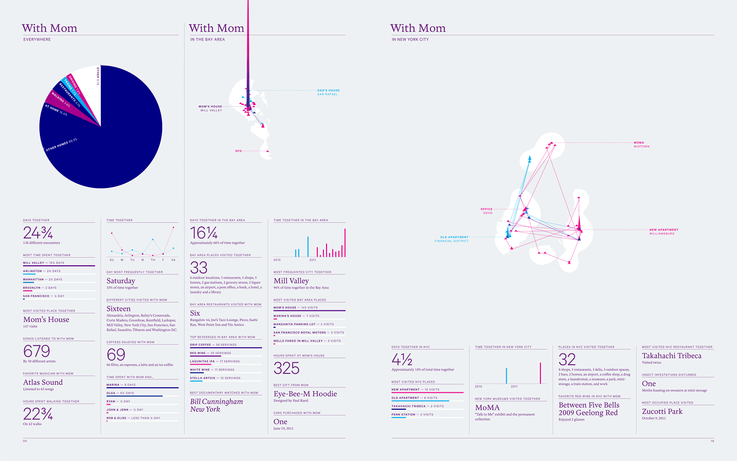
The detail of Felton’s encounters with with his mother is unreal. He had recorded everything from where he spent time with his mother, be it at her house or his father’s house. He also distributed the time spent with his mother into categories in a neatly picture pie chart, explicitly describing the specifics of their interaction location by labeling time spent while driving, on trains, in other homes, or walking.
After examining the 2010/2011 Biennial Report, I looked at the 2005 Annual Report; the first one added to the website. For me, this report is the one that made me understand the “cool factor” of what this man does. Within the 2010/2011 Biennial Report, there were incredible statistics, charts, and organized data, but there was very little in the repot that was eye-catching. However, the 2005 Annual Report features photographs, fun icons and artwork, and clever designs.
For example, here is one of my favorite pages of the report:
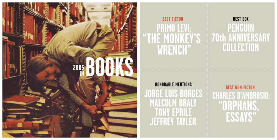
This page offers not only an eye-catching image depicting what the report analyzes but also organizes and clearly expresses the information about each category of books. The color scheme is neat and coordinated and everything pictured here is working for me.
This page about his year’s worth of photography was also incredibly attractive and intriguing:
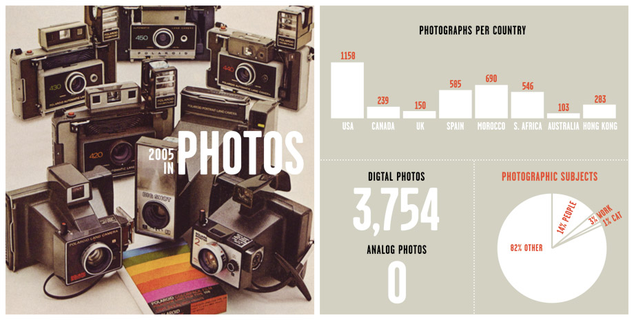
This page identified how many photos he took over the year, what countries he took them in, and what his subject matter was. In comparison to the 2010/2011 Biennial Report, this page presents the information in an exciting and artistic manner while still being easily understood and analyzed.
Overall, Nicholas Felton seems like he would be the most organized individual I could ever meet. His personal annual reports, though eccentric, are remarkable.
